Start Designing for Free!
By Bliss & Bone
March 2026
Your wedding website is the first place guests go after they receive your save the date — for hotel blocks, travel logistics, event schedules, and anything else they need before they can start planning. The design sets the tone before they read a word. These wedding website examples and samples are organized by style so you can find your direction quickly, with page-by-page wording guidance and a FAQ covering the most common questions below.
Ready to build? Browse wedding website templates and customize every page, color, and font from one dashboard, with built-in RSVP collection and guest communication included.
Tropical and botanical designs suit outdoor celebrations, destination weddings, and couples who want something lush without tipping into maximalism. The strongest examples use foliage as a frame for the typography rather than a backdrop that competes with it.
Floral wedding websites range from soft and romantic to moody and oversized. Pale pastels on a white ground read as spring garden party. Dark-filtered blooms with shadow and depth read as evening celebration. Before choosing a floral design, consider the lighting and setting of your venue — the best floral examples feel like a preview of the event rather than a generic arrangement.
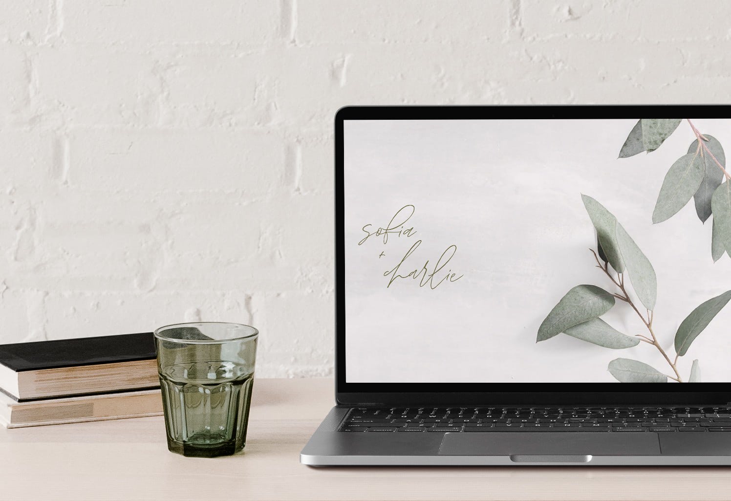
Classic and clean designs are the most versatile in the collection. They work for black-tie events, outdoor ceremonies, and everything in between because they let the couple's photos and details carry the weight. The defining features are strong typographic hierarchy, restrained color, and generous white space. If you are undecided on aesthetic direction, starting with a classic template is almost always the right move.
Modern designs prioritize bold typography, architectural layouts, and a visual language that feels current rather than traditional. The strongest modern examples use a consistent color story across every page — not just the hero — so the site reads as intentional from arrival to RSVP. They suit couples who want the website to feel like an extension of their personal aesthetic rather than a wedding industry default.
Rustic designs span a wide range — from raw wood and mountain landscapes to beachy palettes and soft boho tones. What connects them is texture and warmth. The best rustic examples feel grounded rather than decorated, and they work well alongside engagement and venue photography. If your wedding is outdoors, at a barn or farm, or in a landscape-heavy setting, a rustic design will feel consistent with what guests experience when they arrive.
Script and handwritten designs suit couples who want something that feels personal and intimate rather than formally designed. The strongest examples use script as a typographic accent — names, a date, a single headline — rather than throughout the body copy, where legibility suffers at screen resolution. Pairing a script headline with a clean serif for supporting text is the standard approach, and it works because contrast creates hierarchy without sacrificing readability.
Destination wedding websites carry more information than local ones because guests are making travel decisions, not just logistics checks. The strongest destination examples include a dedicated travel page with specific flight options and transfer times, a hotel block link with the booking cutoff clearly visible, a local area guide with 3–5 recommended restaurants or activities, and a full event timeline so guests know how many nights to book.
The welcome message on a destination site should acknowledge the ask directly. "We know this is a trip and we want to make it as easy as possible to plan" positions the website as a resource, which is what it needs to be. Guests who feel the couple has thought through their logistics are significantly more likely to commit early.
Design-wise, destination examples that lean into the setting outperform generic templates. The Plunge 01, Ibiza, Damien, and Brando designs all carry strong location signals, like dramatic imagery, atmospheric color palettes, and typography that reads as somewhere specific rather than anywhere.
For the timing of destination-specific communication, the save the date etiquette guide covers when destination guests need information relative to local ones.
Color communicates tone faster than any other design decision. Dark palettes — navy, charcoal, deep green — read as formal and atmospheric. Light and neutral palettes are the most versatile and photograph best across a range of venue settings. Warm tones suit outdoor and daytime celebrations. Cool tones feel polished and suit evening events. Metallic accents work best used sparingly: a gold monogram on a white ground, foil-effect text on a dark background.
The practical rule: choose a palette that matches your venue, not just your stationery. Guests will see your website before they see the space, and the two should feel like the same world. For couples who want something genuinely distinctive, beautiful wedding websites and unique wedding websites cover more specific direction on elevated and unconventional design approaches. If you are still deciding on your overall look, custom wedding website ideas covers how to build a fully personalized aesthetic from scratch.
The design gets guests to your site. The copy answers the questions that would otherwise land in your inbox. Here is what strong wedding website wording examples include, page by page.
One to three sentences. Set the tone and make guests feel like they are already part of it. "We can't wait to celebrate with you in Sonoma this October" communicates more than "Welcome to our wedding website."
How you met, how you got engaged, in your own voice. The best Our Story examples are specific — a place, a moment, a detail only the two of you would remember. One specific, honest paragraph lands harder than a generic milestone recap.Two formats work consistently: a single scene-based paragraph built around the moment you met, or a two-part structure — how you met, then how you got engaged — kept to one paragraph each. What to strip: generic openers, vague timelines, anything written in the third person.
Names, relationships, and one to two sentences per person. "The person who talked me into saying yes" is more memorable than "my best friend for fifteen years." Keep it warm and brief.
Link directly to your hotel block with the cutoff date clearly visible. Add two or three alternative options with distance to the venue. For destination weddings, include the nearest airports and approximate transfer times. Guests booking travel for a destination wedding need more lead time than usual — the save the date etiquette guide covers when to get that information in front of them.
Answer the questions guests will actually ask: parking, dress code, children policy, ceremony start time, whether cocktail hour precedes the reception. A well-written wedding website FAQ cuts pre-wedding logistics emails significantly.
Keep the form clean. Meal selection and dietary restrictions are standard. Song requests and advice for the couple are optional touches that guests enjoy. For multi-event weekends, group guests by event so each person only sees what applies to them. For a full breakdown of how to manage RSVPs across the invitation and website, see RSVP wedding websites and the RSVP invitations guide.
At minimum: the ceremony date, time, and location; reception details if different from the ceremony; RSVP form; and travel and accommodation information. Most couples also include an Our Story section, wedding party introductions, a FAQ page for guest logistics, and a link to the gift registry. The more complete the site, the fewer questions you field in the weeks before the wedding.
Start with the venue and overall wedding aesthetic. A formal ballroom wedding calls for a different design than an outdoor garden ceremony. Look at examples in the style category that matches your setting (tropical, floral, classic, modern, rustic, or script) and shortlist two or three before customizing. Most couples find that seeing the design with their own names and photos in it is the fastest way to make a final decision.
It should cover how you met and how you got engaged, told in your own voice. The strongest Our Story examples are specific rather than chronological — a detail, a place, a moment that is genuinely yours. A short, honest paragraph outperforms a long milestone list every time.
A wedding party bio should be three to five sentences: who the person is, how they know the couple, and one detail that gives guests a sense of their personality. Brevity is an advantage here. Guests read these quickly, and a short, specific bio is more memorable than a long one.
They serve different purposes and work together rather than replacing each other. The online invitation delivers essential event details to your guests and collects RSVPs. The wedding website holds everything else: travel logistics, hotel blocks, the gift registry, event schedules, and the full story of the couple. The invitation links to the website; the website does not replace the invitation.
Free wedding website plans typically cover a basic design with limited customization, a standard URL, and simple RSVP collection. Paid plans add custom URL options, enhanced RSVP management, private event creation for specific guest groups, email and SMS guest communication, and premium design access. For couples managing multiple events across a wedding weekend, the RSVP management tools in a paid plan make a practical difference.
Yes. Bliss & Bone's design collections extend across wedding websites, online wedding invitations, and save the dates, so the visual identity of your wedding weekend stays consistent from the first communication guests receive to the last.
Bliss & Bone's wedding website builder handles design through delivery in one place. It also has customizable pages, built-in RSVP collection, and guest communication by email, SMS, or WhatsApp. Start building for free and upgrade when you're ready.

